Formatting your documents
Content is obviously more important than form, but that doesn’t mean you shouldn’t aim for professional-looking documents. This is even more important as you get into grad school and start writing or publishing papers, chapters, etc. Make sure to have a website to host your materials; you can also share your work using repositories like OSF. Your online presence is crucial these days, and maintaining a personal website is one of the main things you should do to make sure people know who you are.
Producing your documents
There are basically two options: the most popular option is usually referred to as what you see is what you get (WYSIWYG). Microsoft Word is the most obvious example: everything you type shows up in the actual document, given that content and form are one and the same. In Word, what you see on the screen is what the document will look like if you print it.
The second option involves separating content and form. Two examples are \(\LaTeX\) (usually pronounced “lay tech”) and Markdown. These options require learning a language, though Markdown is possibly the easiest language there is. If you want to make a word bold in \(\LaTeX\), you type \textbf{word}; in Markdown, you type **word**. In both cases, the output will be the same: if you compile or typeset the document, you’ll see a bold word in a PDF document. Markdown’s output is typically an HTML document. But your content file will still be there, with \textbf{word} and **word**, respectively. In other words, your actual content is the code; the PDF is the compiled output, i.e., your form. I’ll focus on \(\LaTeX\) here, but be sure to read about Markdown and Quarto, as they are very easy ways to get good results. For data analysis reports, Quarto is by far the best tool I know.
Besides being the perfect tool for documents that have code in them, Quarto also offers a simple unified solution to document preparation. It uses markdown, so it’s very easy to learn compared to html or \(\LaTeX\). It then allows you to create PDF, html, and doc files from its markdown source. Crucially, its PDF files use \(\LaTeX\) (or Typst), so you get the pros without the cons. Of course, the disadvantage of using markdown is that you may lack certain features that you would otherwise have in \(\LaTeX\). In that case, you will need to complement your markdown with some code; the same goes for html documents. Still, for most tasks and documents, you will likely be satisfied with Quarto without any additional work.
Microsoft Word
Microsoft Word can certainly do a decent job most of the time. Crucially, Word is as user-friendly as an app can be. It is true, however, that most \(\LaTeX\) users would never go back to using Word.
If you do use Word, however, be an advanced user. Maria Gouskova’s tutorial is a great place to start. For example, use headings and cross-references; make sure to have installed the appropriate fonts to get decent IPA symbols; and always generate PDFs of your doc files to avoid surprises. In addition, spend some time learning how to manage references (see below).
Pros
- Easy and fast (for short documents)
- Everybody knows it
- Most journals are at least OK with
docmanuscripts - Makes your life easier in the short run
Cons
- Slow for longer documents
- Requires additional software to manage bibliographies
- Can be unstable and buggy
- Poor spacing
- Final products often don’t look polished
- Math doesn’t look good
- Different Word versions or different computers can change how your
doclooks - Not free
\(\LaTeX\)
If you’re a perfectionist and want your final document to look as good as possible, \(\LaTeX\) has always been the best option, and it’s free (open source). It is, however, more demanding, since you have to actually learn how to use it first, and the learning curve can be steep if you’re coming from Microsoft Word and have never coded. \(\LaTeX\) is great for longer and more complex documents, like papers and theses, as it automates cross-referencing, headings, figure and table numbering, and more. In addition to that, there are different packages to typeset Linguistics.
To me, the best place to get started is ShareLaTeX (now Overleaf)—visit this link, for example. They have great video tutorials on their YouTube channel, and they also have an online \(\LaTeX\) environment, so you don’t even need to install \(\LaTeX\) if you don’t want to. Once you understand the basics, Google will solve most of your questions.
Pros
- Best results
- More automation
- Bibliography management included (
bib) - More control
- Makes your life easier in the long run
- Final product is a PDF
- Free
Cons
- Steep learning curve
- Even simple things may require complex steps
- Not many people use it in the Humanities, though a good number do in Linguistics
- Many journals will not accept \(\LaTeX\) manuscripts (i.e.,
texfiles)
Typst
Typst is a new language. It’s fast, light, intuitive, and modern. Unlike \(\LaTeX\), it doesn’t feel outdated; its syntax is much cleaner, and its errors are much easier to understand. It also compiles instantaneously and has native support for UTF-8. Crucially, its output is at the same level of quality as \(\LaTeX\). In my workflow, I now only use Typst. There are great tutorials on the official website, and YouTube also has some videos on the topic.
Pros
- Best results (same level as \(\LaTeX\))
- Much more automation
- Bibliography management works with
bibtoo - Very intuitive to learn and debug
- Extremely light
Cons
- Still young
- Journals will take a while to accept
typfiles - The package ecosystem is still small compared to \(\LaTeX\)
Depending on what exactly you need to accomplish, Typst may not offer the packages you need yet. That being said, I’ve developed two packages for linguistics that cover most of what you’d need, so check them out. Finally, to use Typst, you can try the online editor. If you enjoy it, you can easily install Typst locally and use Visual Studio Code, Positron, Quarto, or Nvim as your IDEs or editors. Crucially, you will want to look for tinymist (extension or plugin).
References
Whether you’ll be using Word, \(\LaTeX\) or Typst, it’s important to learn how to manage references. If you’re using Word, EndNote is a common paid option, but I’d personally go with Mendeley. If you decide to use \(\LaTeX\) or Typst, then bib is the obvious way to go. The bottom line is: spend some time learning how to work with references as soon as possible and create your own library of references. Some people make their own libraries available, so you can use theirs as a starting point. This will make your life much easier and will save you a lot of time.
The thing to bear in mind is: the more you automate, the fewer mistakes you will make, and the more time you save. So, if you can automate most components in your document, which is what \(\LaTeX\) does, you’ll definitely reduce inconsistencies. References are a special component not only because you have to spend a lot of time checking all the details in each entry, but also because different documents will likely require different bibliography styles.
Tables and figures
As always, Google how to make nice tables. You normally avoid vertical lines, and use thicker lines to separate the header from the body. Your column headers are usually highlighted, in bold for example. Numbers are right-aligned; text is left-aligned. These are basic rules, which may or may not apply to the kind of table you’re looking for.
Sometimes you actually want to add somebody else’s table to your document, say because you’re citing that person’s study. The wrong way to do that is to take a screenshot of the original table and paste it into your document. The better way to do that is to redo the table, so that it will actually be consistent with your own document, and so that you won’t have any problems with pixelated images.
Some people actually take screenshots from Microsoft Word, and sometimes they forget that certain words might be underlined by Word’s spelling rules. So you end up with a table like this:
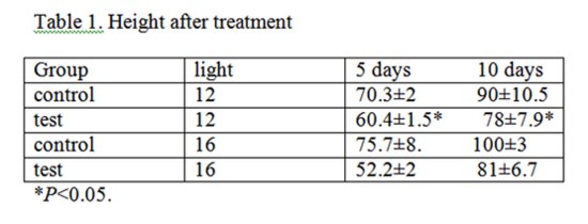
This table has several problems:
- Green line under “Table 1”
- Column lines, which almost always look ugly
- Column headers not bold, and capitalization is inconsistent
- Number columns not right-aligned
- Not clear what the units are
Another obvious problem with taking screenshots is resolution. Pixelated figures look terrible and unprofessional. Screenshots are never ideal. Given that it takes five minutes to reproduce this table in Microsoft Word, why not do it?
Recreating a figure is obviously much more complicated than recreating a table. If you have to take a screenshot of a figure and paste it into your document, make sure to zoom in on the figure as much as possible before taking the screenshot. This will improve the resolution of the figure as a whole.
You’ll often need plots in your documents. If that’s the case, here are a couple of things to bear in mind.
The typical objective of a plot is to make something easier to understand:
- See this presentation on efficient data visualization
- Most of the time, less is more. Cluttered plots are confusing plots. There’s a sweet spot of efficiency whenever we create a figure: not too much information, not too little information.
- Your figure should have a clear caption, though length depends on journal guidelines
- Make sure you’re using the optimal type of plot for your data
- If you’re using 3D plots in a static document, ask yourself if that will actually help the reader understand the plot
- If you’re using colors, make sure they improve the plot in a meaningful way
- If you have text along the axes, make sure the font size is appropriate
Slides
Here you have numerous options: from \(\LaTeX\) to Typst to PowerPoint (Google Slides, etc.) to HTML to Prezi to Quarto yet again. Whichever tool you prefer to use, the objective of using slides is to (visually) help you communicate your ideas during an oral presentation—note the emphasis on visually. Needless to say, your slides shouldn’t simply be a bigger version of your text.
- Don’t have entire paragraphs on your slide
- People don’t want to read a text during your talk
- You don’t have to say everything that’s on the slide
- Avoid actually reading your slide
- Keep slide content concise
- Make use of bullet points and telegraphic language
- Avoid showing all bullet points at once
- Use an appropriate amount of color to guide the audience, but be consistent
- Bold and italics can definitely help
- If you like to use fancy animations, be careful not to be too distracting
- Avoid using colorful backgrounds
- If you can’t help it, make sure your font color is clear enough against the background
Copyright © Guilherme Duarte Garcia