library(Fonology)
library(tidyverse)

# Import vowels dataset from Fonology package
vowels = vowels |>
  # Select only the three vowels of interest
  filter(vowel %in% c("a", "i", "u")) |>
  # Create column for height
mutate(height = if_else(vowel == "a", "low", "high"))Colours in ggplot labels
ggplot2
R
colour
Using colours to represent levels in ggplot titles: a great way to have clean but informative plots.
Getting some data
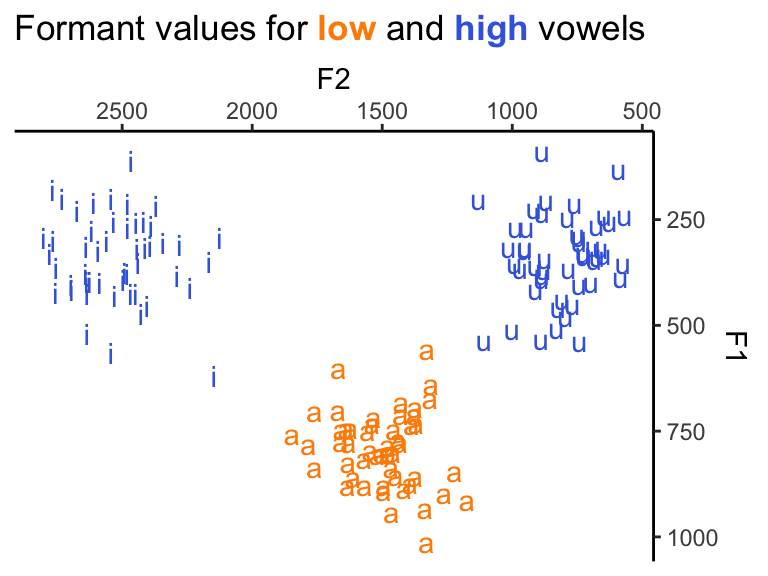
Let’s use the vowels data set in the Fonology package to create a figure where we plot F1 and F2 for three vowels (a i u). We have multiple tokens per type, and we will use colour to represent which vowels are low and which are high to illustrate the point here. Normally, we’d use a key to explain what each colour means. Here, however, we’ll get rid of our legend and use colours in the plot title instead.
In the code below, we focus on the three vowels in question only, and add a new column that classifies the height of each target vowel. This new column, height, will be the variable we’ll represent with colours.
TipMore about plotting vowels
You can find a tutorial on how to plot vowels using ggplot2 here.
| vowel | F1 | F2 | height |
|---|---|---|---|
| a | 733.4178 | 1387.8191 | low |
| u | 365.8033 | 880.0463 | high |
| u | 211.8484 | 761.6820 | high |
| i | 453.4869 | 2404.2333 | high |
| a | 768.0256 | 1438.8807 | low |
Five sample data points
Colours
To represent high and low, we’ll use blue (royalblue) and orange (darkorange), respectively.
colours = c("darkorange", "royalblue")
names(colours) = c("low", "high")
Set up title
Now, we’ll create a variable that holds the title we want to give our future figure. You can see below that we use the glue() function as well as some HTML/CSS and markdown. We could also create a custom subtitle, but for this example we’ll focus on titles only.
customTitle = glue::glue('Formant values for
       <span style="color:{colours["low"]}">**low**</span>
       and
       <span style="color:{colours["high"]}">**high**</span>
       vowels')
Plot
Most of the code below will be familiar if you already use ggplot2. The function formants(), from Fonology, simply inverts both axes to plot vowel formants. The key here is to specify plot.title as ggtext::element_markdown() inside the theme() layer. Once that’s done, customTitle, defined above, will work.
ggplot(data = vowels, aes(x = F2, y = F1,
                          label = vowel,
                          color = height)) +
  geom_text() +
  formants() +
  theme_classic() +
  theme(plot.title = ggtext::element_markdown(),
        legend.position = "none") +
  labs(title = customTitle) +
  scale_color_manual(values = colors)
What are the advantages of a figure like this? First, it has a good amount of information, since we can see all instances of the vowels in question, the two formants in question, in addition to their height. Crucially, though, none of this requires the typical legends for the figure. Because vowels are textually presented (cf. points from geom_point()), and because colours represent height in the title as well, readers don’t need to keep looking back and forth between legends and the actual figure.
Copyright © Guilherme Duarte Garcia