Created: September, 2018. Last updated: August 17, 2025
Just like anything else in R, there are different options to plot vowels. There are, for example, some specific packages you can use (phonR and vowels). But you can easily plot vowels without these packages, simply by using ggplot2—which may be useful if you’re already familiar with the package. If you’d like to create a simple vowel trapezoid, go here.
Step 1: Basics
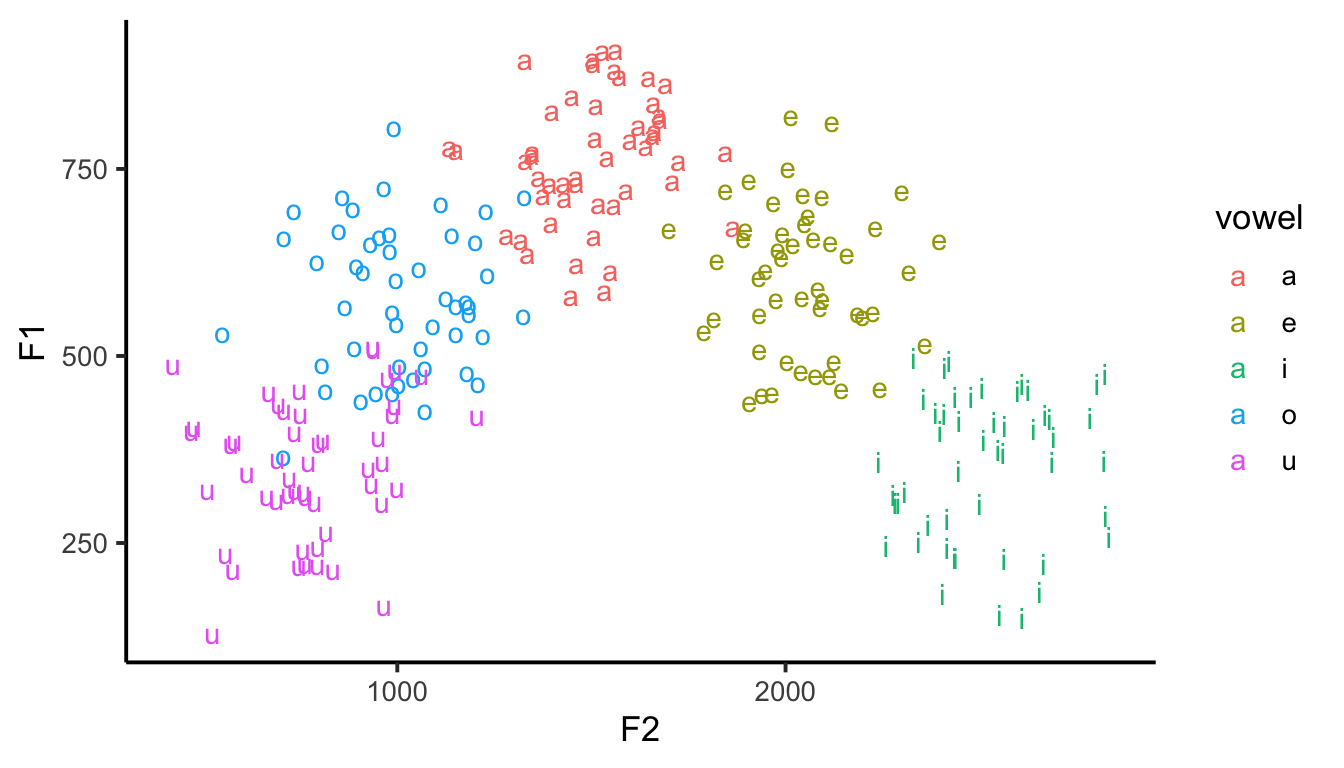
For this example, I’ll create some vowels (random F1 and F2 values taken from a normal distribution), but you can load some existing data, of course (phonR, for example). First, let’s see what a typical ggplot looks like.
Code
library(tidyverse)set.seed(10)vowels =tibble(vowel =rep(c("a", "e", "i", "o", "u"), each =50),F1 =c(rnorm(50, mean =800, sd =100),rnorm(50, mean =600, sd =100), rnorm(50, mean =350, sd =100), rnorm(50, mean =600, sd =100), rnorm(50, mean =350, sd =100)),F2 =c(rnorm(50, mean =1500, sd =150),rnorm(50, mean =2000, sd =150), rnorm(50, mean =2500, sd =150), rnorm(50, mean =1000, sd =150), rnorm(50, mean =800, sd =150)))ggplot(data = vowels, aes(x = F2, y = F1, color = vowel, label = vowel)) +geom_text() +theme_classic(base_size =15) +theme(text =element_text(size =13))
Step 2: Axes
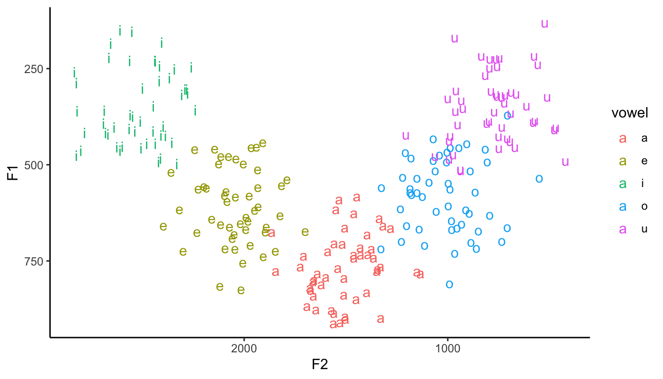
Reversed values
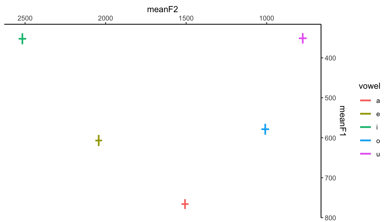
The very first problem with the plot above is that our axes must be reversed. Not only that: ideally, you’d want both F1 and F2 to start at the top-right corner of the plot, just like any typical vowel plot you see in papers.
It’s very easy to shift the axes: simply add a positional argument to scale_x_reverse() and scale_y_reverse(). It’s even easier if you use the formants() function from the Fonology package.
Another thing you could do is use the mean F1 and F2 values along with their standard errors. That would give you two error bars, one for each dimension/variable. There are different ways to do that. For that, let’s use geom_errorbar() and geom_errorbarh().
Code
# First, create summary table (tibble) with means and standard errors# I'm using dplyr here (since I loaded tidyverse above)means = vowels %>%group_by(vowel) %>%summarize(meanF1 =mean(F1),meanF2 =mean(F2),seF1 =sd(F1)/sqrt(n()),seF2 =sd(F2)/sqrt(n()))
Now that we have all the information we need, we can just go ahead and plot the vowel means and associated standard errors.
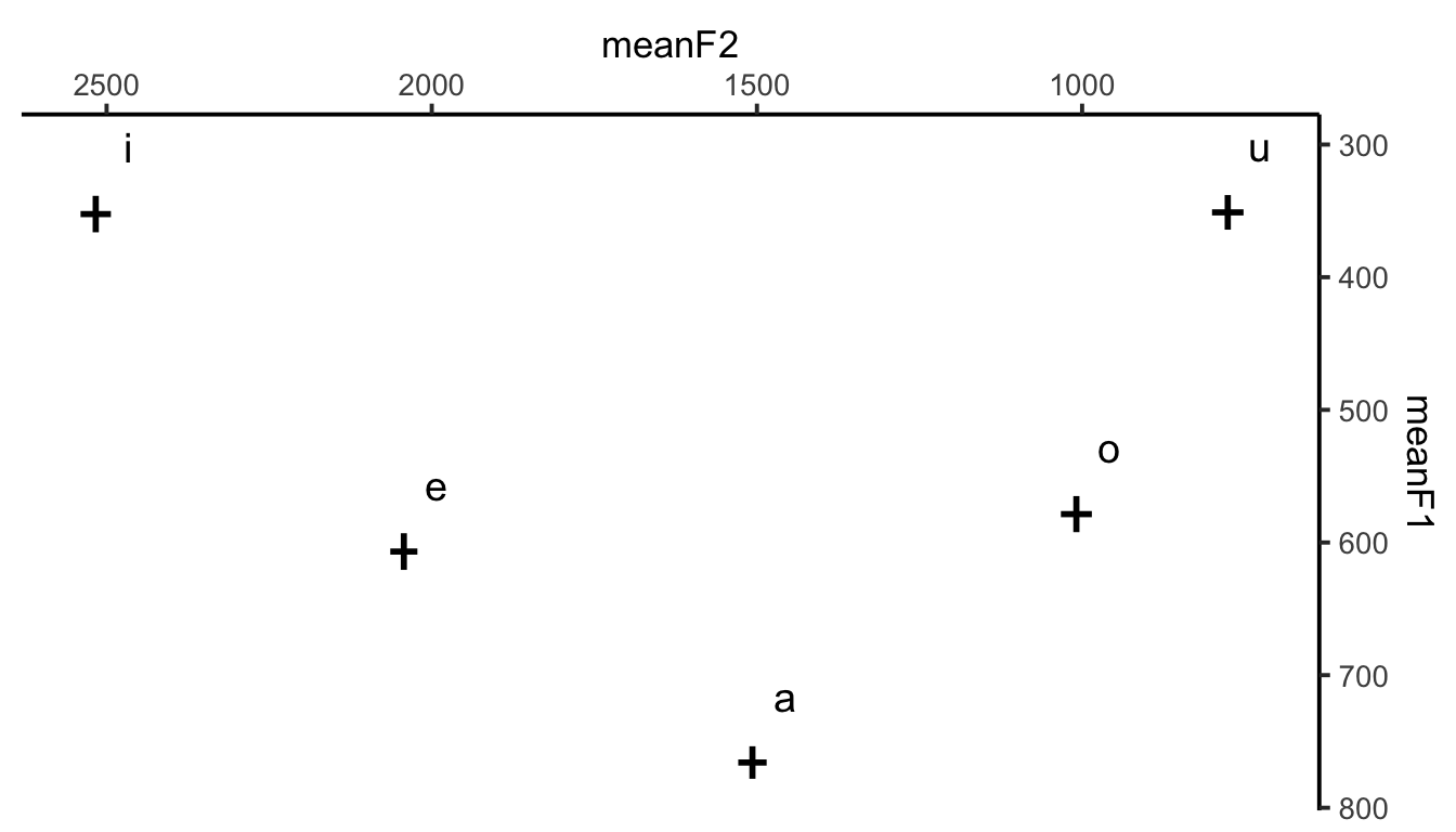
Ok, this looks good, but we have to fix one crucial thing: how do we want to signal the vowels…? One option is to add the vowels themselves to the plot. We probably don’t want them to be right in the middle of the error bars (since they would need to be big, and could therefore hide the actual bars).
TipMore adjustments
You can add the vowels with geom_text() or geom_label(), and then adjust its position so that it doesn’t hide the bars (note that you need an addition aes() argument, namely, label). Another issue you probably want to fix is the presence of a legend (key), which is completely redundant given that we’re using geom_text().
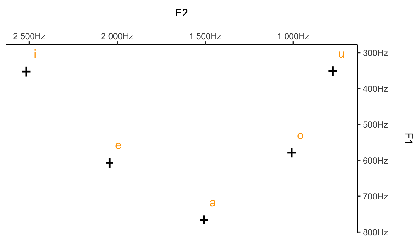
This looks better. You can naturally adjust the fontface, color etc. Finally, let’s adjust the labels (note the \n to break a line) and add Hz to our axes.
Finally, let’s revisit the density plot and adjust its formatting as well. Note that I’m changing the font size, adding some transparency to the actual density layer (so it doesn’t get too cluttered), and controlling the axes a bit better (values and breaks).
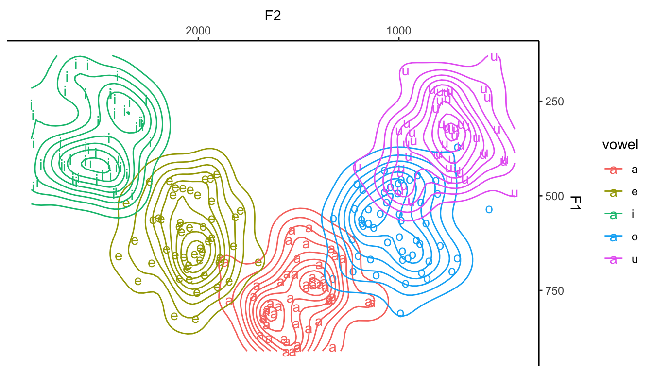
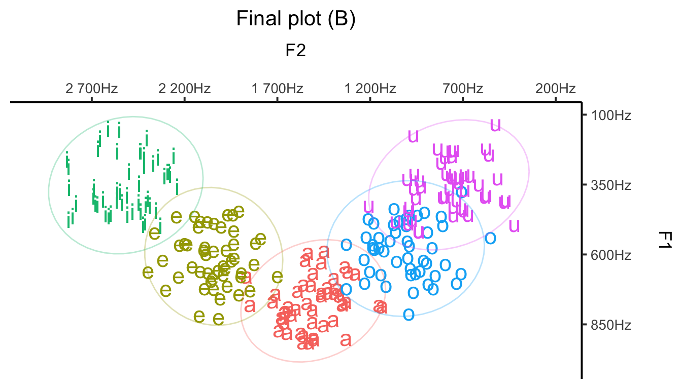
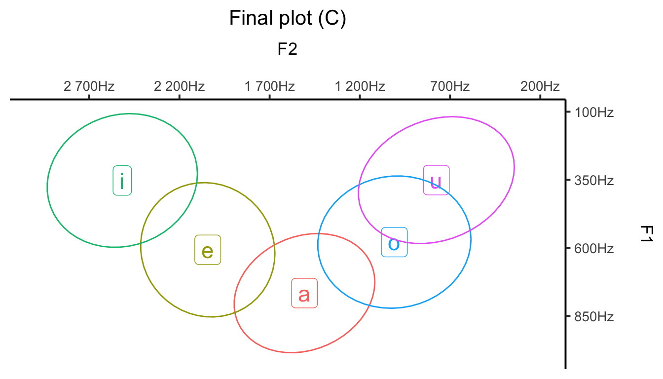
Finally, let’s keep the ellipses but only show the mean F1-F2 values for each vowel (this will give us a more minimalist plot). To accomplish this, geom_label() will need the means variable created above (but stat_ellipse() will still require vowels, so you’ll need to play around with two separate datasets, as shown below).
Code
ggplot(data = means, aes(x = meanF2, y = meanF1, color = vowel, label = vowel)) +geom_label(size =6, fill ="white") +# Font size for vowelsscale_y_reverse(position ="right", labels =unit_format(unit ="Hz", sep =""),breaks =seq(100, 1000, 250)) +scale_x_reverse(position ="top", labels =unit_format(unit ="Hz", sep =""),breaks =seq(200, 3000, 500)) +labs(x ="F2\n",y ="F1\n",title ="Final plot (C)") +stat_ellipse(data = vowels, aes(x = F2, y = F1), type ="norm") +coord_cartesian(xlim =c(3000, 200), ylim =c(1000, 100)) +theme_classic(base_size =15) +theme(legend.position ="none",plot.title =element_text(hjust =0.5), text =element_text(size =13))
TipMore about plotting vowels
You can find more info on plotting vowels using ggplot2 on this blog post.